To increase free trial registrations we generated a new ad campaign that spoke directly to IT practitioners’ pain points.
PagerDuty had become a leader for IT software by using barebones ads and outstanding word-of-mouth. This project was about new design work, but it was also about developing relationships and educating co-workers on the value of marketing design.


PROCESS
01. They weren't even sold on using imagery nor had they ever worked with a copywriter. The first thing I pitched was bringing in a copywriter to help generate researched headlines. We met with stakeholders and convinced the power-that-be to hire a copywriter. Not only did we need to create good work, we had to show our value immediately.
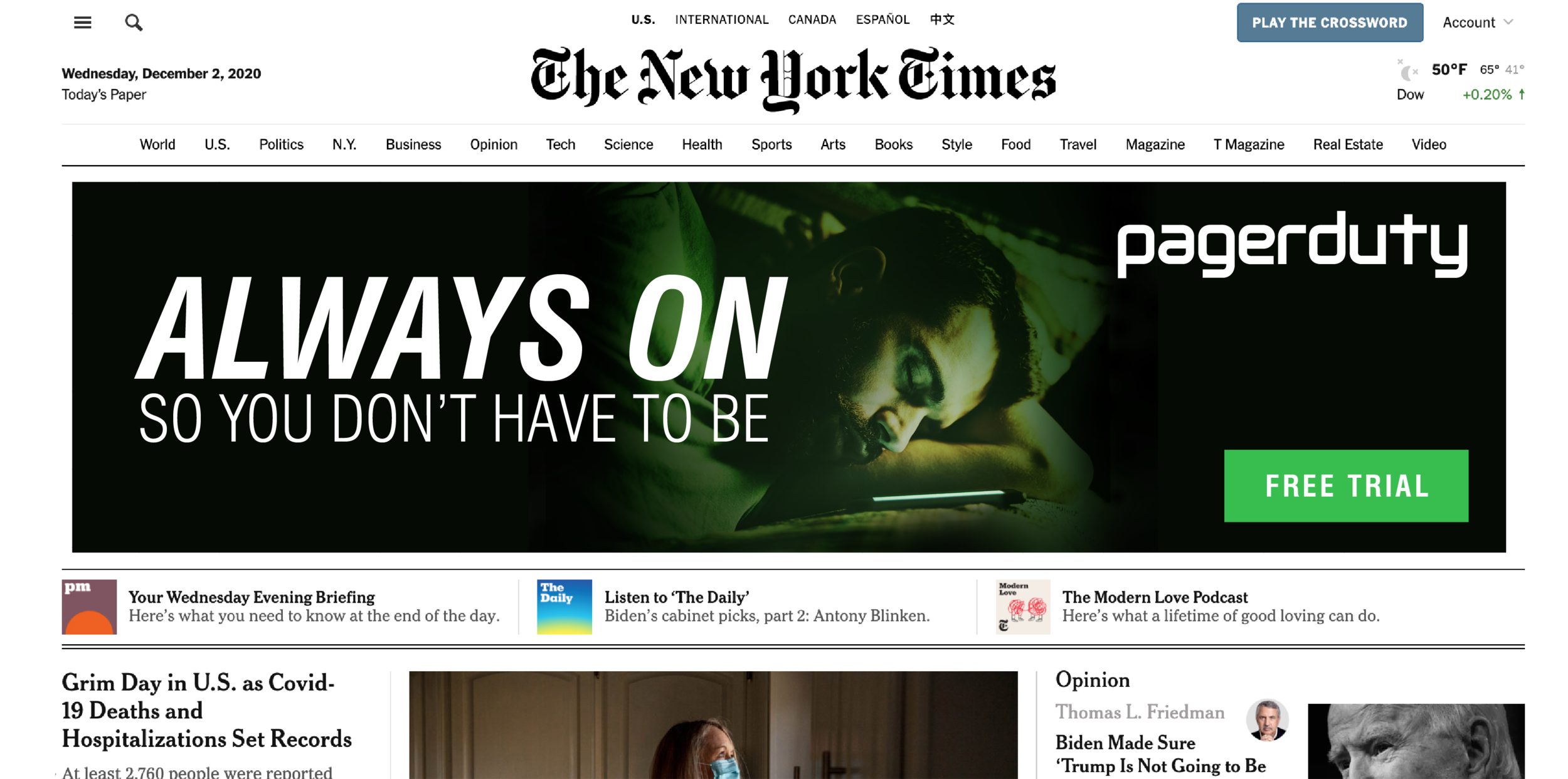
02. We listened to the marketers’ and educators’ thoughts on what makes PagerDuty tick and what pain points its products alleviated. We generated hundreds of headlines and concepts. We boiled down the PagerDuty message to two core ideas: time and stress relief. IT folks lose a lot sleep because of inefficiency. That was a resonant image and we held onto it.
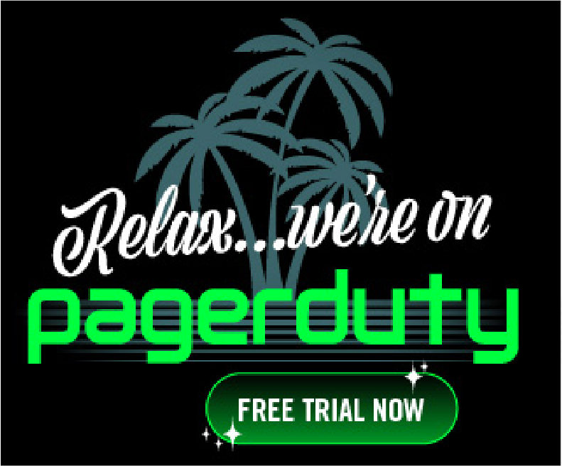
03. PagerDuty had no brand guidelines at this point. My fellow designers and I needed an abstracted background to build on brand equity, but that would also be legible in many contexts, so we went with a simple low poly field of green that had recently been used for both graphics. It referred to our data functionality and how it simplified people's lives. A conversation with one of the sales team brought up a t-shirt they had used as swag recently: Relax We’re On PagerDuty. It was really popular. We updated the type and went with a retro feel. While we also opened up the throttle creatively we were also sure to include creative that was successful in other channels.